Animated Landing Page for a Modern Consulting Studio
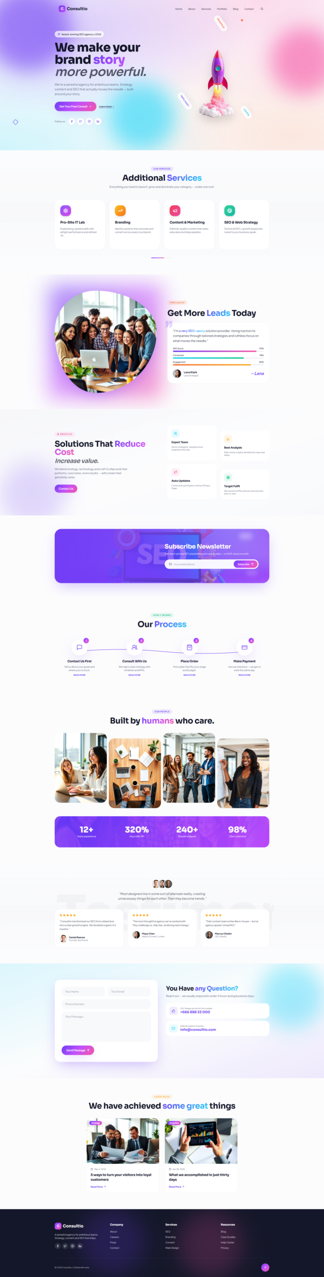
It’s a richly animated, single page marketing website for a boutique business-consulting studio. Inspired by the Casethemes “Consultio” demo, it reimagines the original layout with a more refined design system, smoother motion, and a stronger editorial feel — built entirely in React, TypeScript,
1. Project Overview
Consultio is a fully responsive, production-ready landing page concept for
a consulting agency that offers strategy, funding, and operations services.
The page tells a complete brand story across 14 carefully composed sections,
from a cinematic hero through services, team, projects, testimonials,
resources, and contact — all without requiring a backend (the backend will
be added in a follow-up iteration).
2. Design Language
– Typography: Poppins (display headings) paired with Roboto (body), the
same font family used by the original Consultio theme, for an authentic
yet modern editorial voice.
– Color palette: a warm “ink + ember” system — deep ink navy
(hsl 222 33% 8%) as the primary dark surface, off-white background
(hsl 30 25% 97%), and a confident orange accent (hsl 16 95% 54%) with a
glowing variant for highlights and CTAs.
– Surfaces: layered shadows (soft / elegant / glow / ink), subtle grain
overlays, dot grids, and radial gradients give every section depth.
– Tokens: every color, gradient, shadow, and motion curve is defined as a
semantic CSS variable in index.css and exposed through tailwind.config.ts,
so the entire visual identity can be re-skinned from a single file.
3. Motion & Interactivity
Animation is a first-class citizen, powered by Framer Motion:
– Parallax hero with scroll-driven scale, translate, and fade.
– Word-by-word headline reveal with an animated SVG underline.
– Scroll-triggered Reveal wrapper used across every section.
– Animated number counters and SVG ring-progress charts.
– Infinite marquee strip of service keywords.
– Floating “blob” gradients, pinging dots, and a slow-rotating trust badge.
– Filterable project gallery with shared-layout tab indicator and
AnimatePresence transitions.
– Testimonial slider with crossfade and animated pagination dots.
– Sticky header that fades from transparent (white text over the dark hero)
to a blurred, bordered surface (dark text) once the user scrolls.
– Hover micro-interactions on every card, link, button, and image.
4. Sections
Header • Hero • Marquee • Services • About • Approach (4-step model) •
Global Network • Testimonials • FAQ + Quote form • Team • Facts (counters)
• Projects (filterable) • Contact • Story (25 years) • Blog • Footer.
5. Technical Stack
– React 18 + Vite 5 + TypeScript 5
– Tailwind CSS v3 with a custom design-token layer
– Framer Motion 12 for all animations
– shadcn/ui primitives (Accordion, Button, etc.) customised through the
design system rather than overridden inline
– lucide-react for iconography
– All imagery generated as on-brand demo assets and imported as ES6 modules
from src/assets for optimal bundling
6. Engineering Principles
– Strict separation of concerns: each section lives in its own file under
src/components/sections, with shared motion helpers in
src/components/site (Reveal, Counter, Logo).
– Zero hard-coded colors in components — everything uses semantic
Tailwind/HSL tokens.
– SEO basics in place: descriptive title, meta description, semantic
headings, alt text on every image, and lazy-loading on non-LCP assets.
– Mobile-first responsive layout from 320px up to 1400px containers.
7. What’s Next
The next iteration will introduce a backend (Lovable Cloud) to power the
contact and quote forms, persist testimonials and projects, and add a
lightweight CMS-style admin for editing copy and imagery without code.